Case Study: Fresh Coast

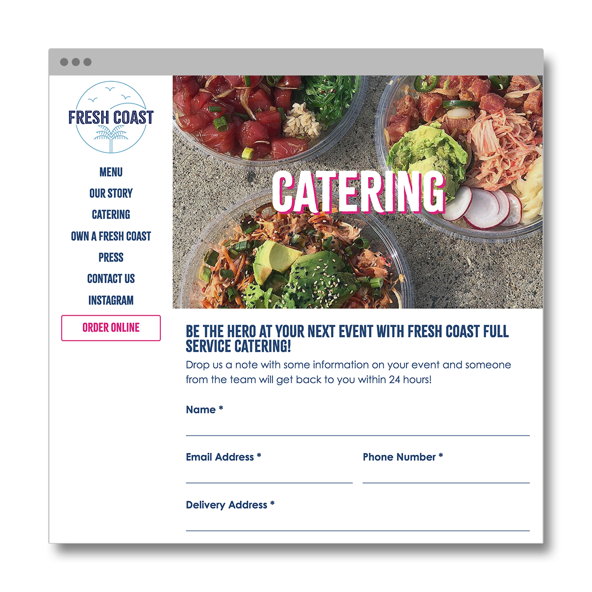
Fresh Coast, a restaurant in Newark, NJ, is inspired by the healthy and flavorful foods of Hawaii and California. As part of an effort to rebrand and realign their business goals, Fresh Coast wanted to develop a new website that would help them achieve their long term goal of expanding into new markets through franchising.

Before starting our design, we set out to envision how customers would initially encounter the website and identify what would be most valuable to them. In doing so, we ended up focusing on two major user groups:

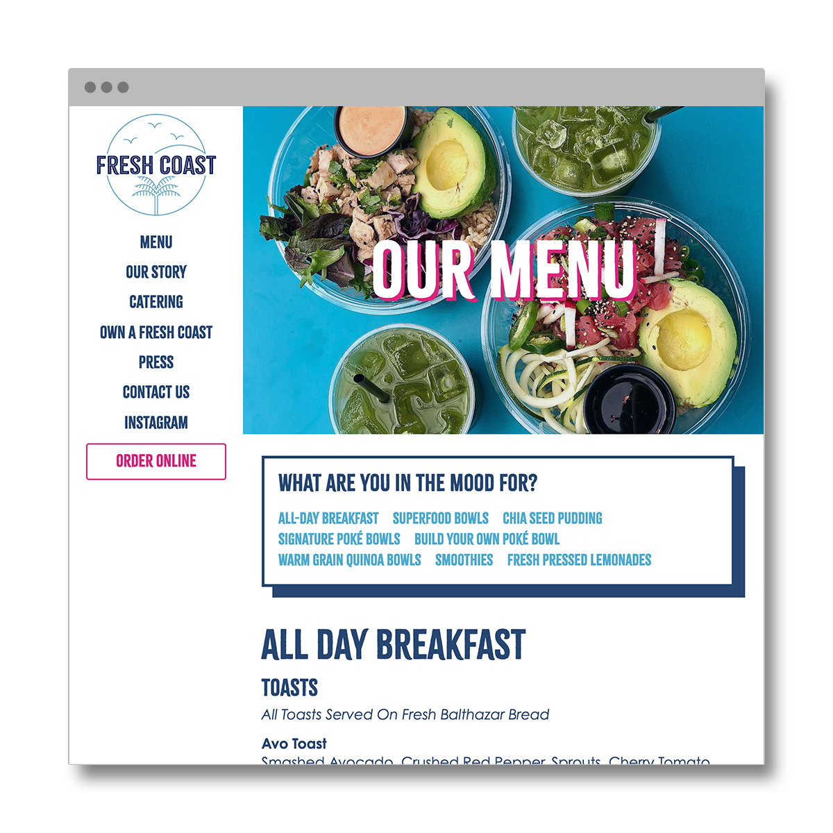
visit website (archive)
Audience 1: Entrepreneurs

This is who our client is most excited about visiting the website.

Who referred them?

  • Business owner

  • Colleague

  • News article

What are they looking for?

  • Business information/history

  • Franchising information

  • Franchising application

What device are they most likely using?

  • Laptop

  • Desktop

Audience 2: Hungry Customers

This is who we anticipate being our most common users.

Who referred them?

  • Friend recommendation

  • Instagram/Facebook post

  • Discovery from Google Maps/Yelp/etc.

What are they looking for?

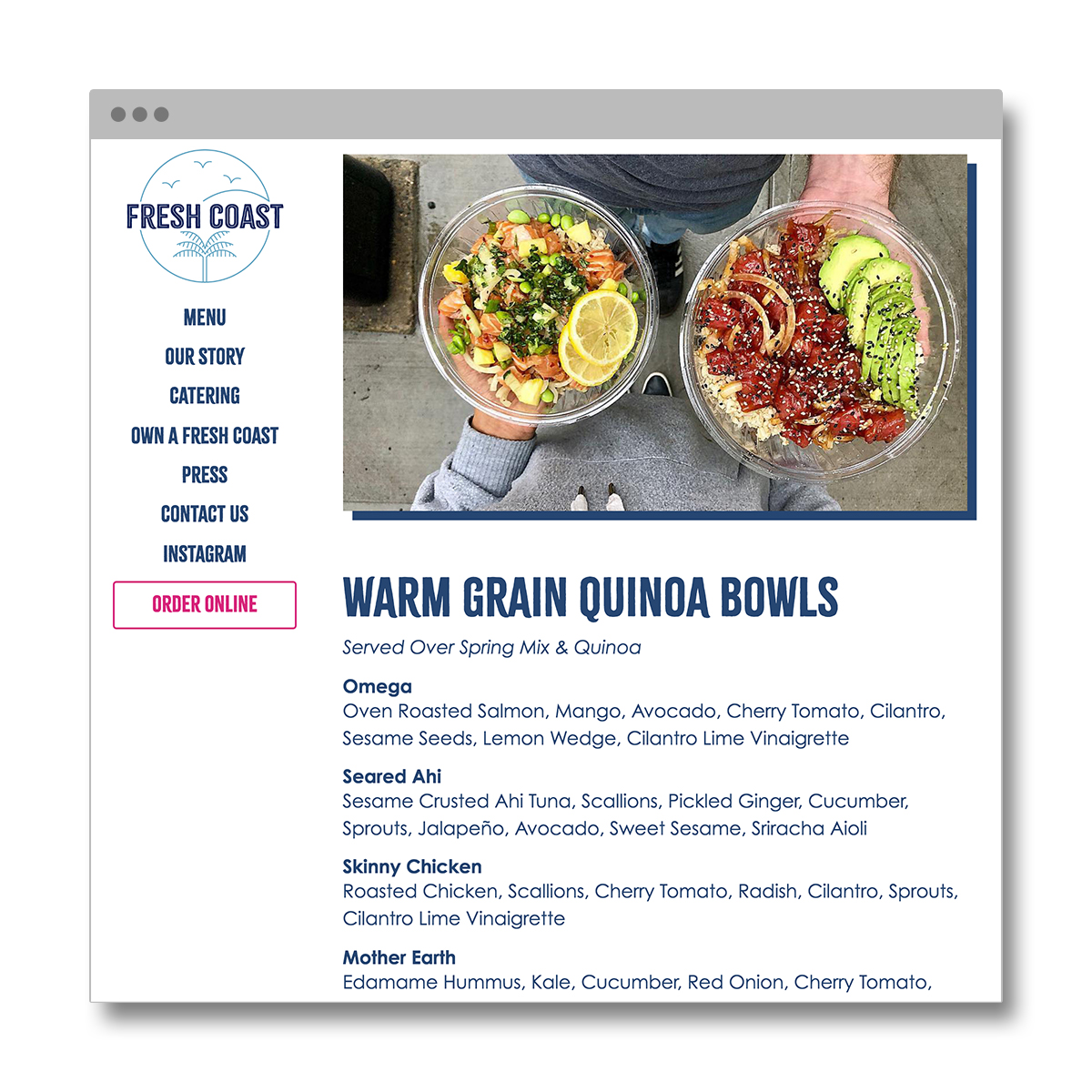
  • Menu

  • Address

  • Delivery information

  • Hours

  • Dietary information

What device are they most likely using?

  • Smartphone

We identified that both users would have fundamentally different experiences, due to their different motivations as well as the different devices they’d use to access the website. We kept these factors in mind during our initial design stages, prompting us to include features that cater to one audience more than the other, depending on the circumstances.

The Entrepreneur

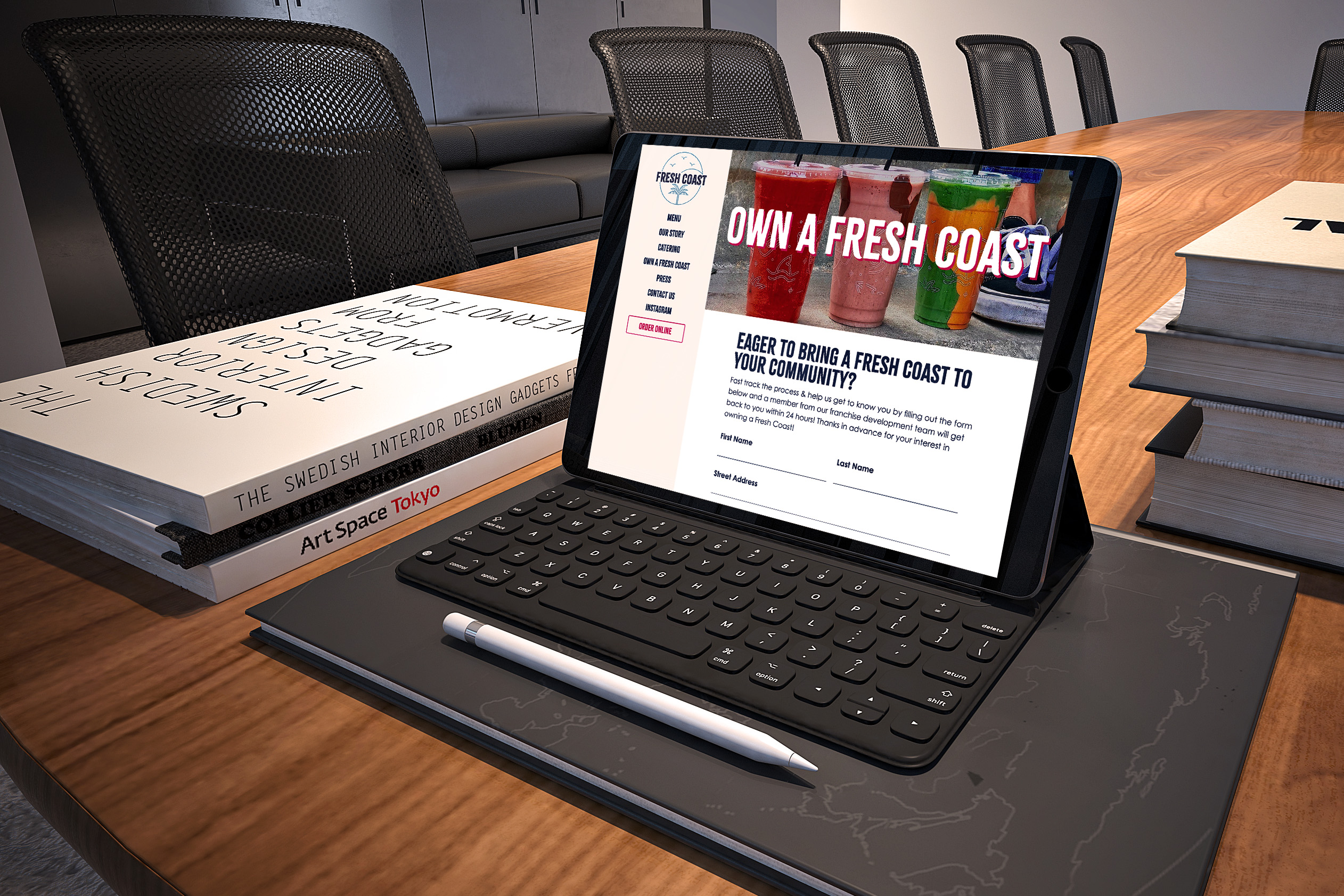
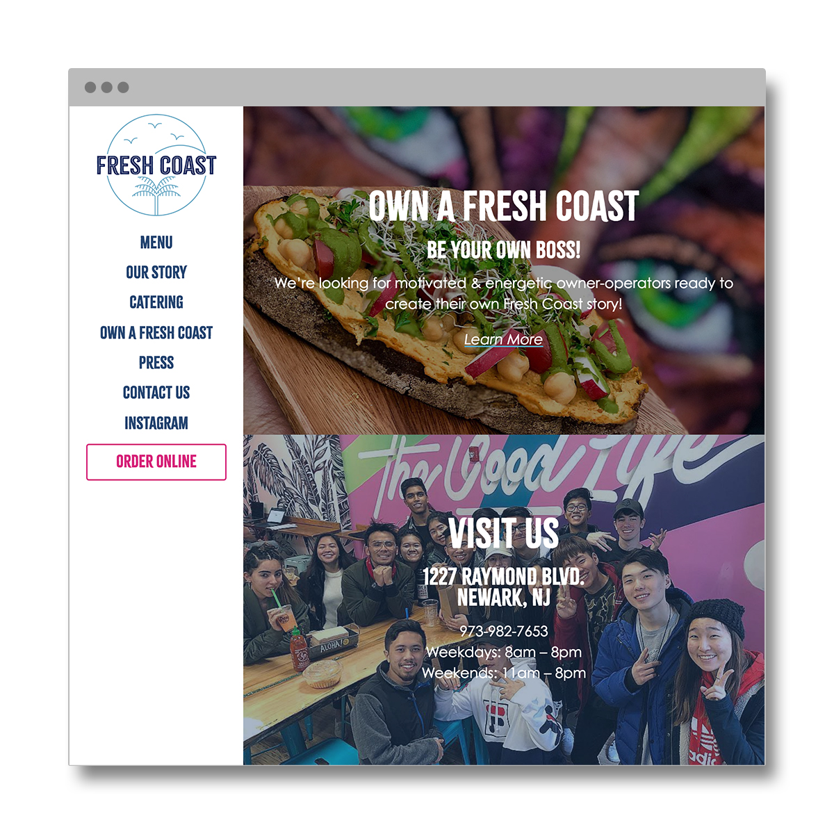
One of the key functions of this website was to help Fresh Coast with their franchising efforts. In assisting with their goal to establish Fresh Coast locations across the country, we needed to ensure this website would speak to the culture and vibe of the Fresh Coast brand, without creating limitations to Fresh Coast’s current location in Newark. The website also needed to prioritize professionalism, so any potential franchise owner visiting the site could see the brand as reputable and trustworthy – and imagine themselves being part of the Fresh Coast story.

The Hungry Customer

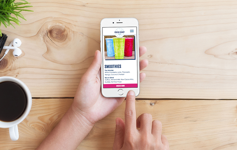
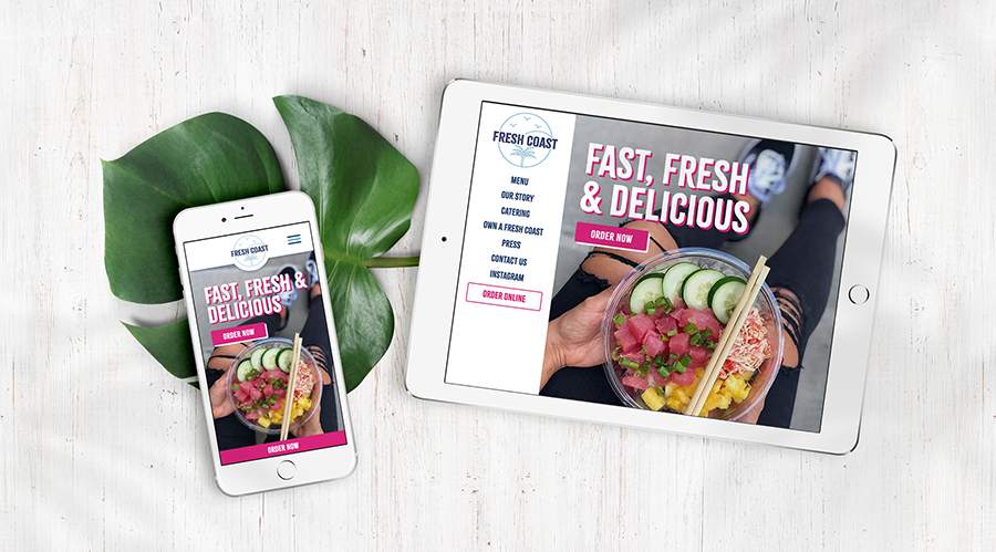
We knew that many of the website’s users would be coming to the site on their phones, possibly being directed to Fresh Coast by the brand’s large Instagram presence. Our mobile-first approach helped to ensure users would always have a great experience accessing the site from any device.

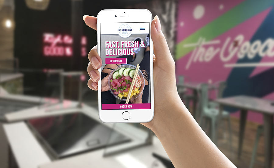
To help capitalize on the needs of the customers user group, we included an “Order” button in the navigation menu and added an additional “Order Now” button featured prominently on the bottom of the mobile website at all times. That way, a potential customer who saw a delicious poke bowl on the Fresh Coast Instagram feed can get straight to ordering it in just one click! 🍲

Performance

Recognizing that Fresh Coast’s customers might often be on the go, optimizing the loading and performance of the entire website was a key focus for us. Utilizing all of our usual techniques and extensive testing, we created an optimized experience that loads in under 3 seconds, even over a 3G mobile connection. The finished website scored top marks from web optimization tools by Google and Pingdom.

Preparing the Site for Future Updates

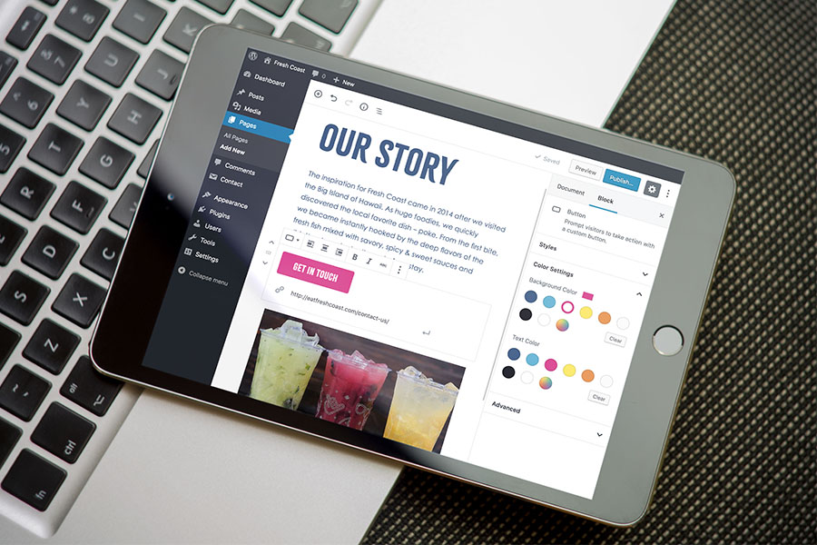
The site was built using Wordpress and used the default editor with some added enhancements. We customized the editor by integrating their brand colors and typefaces so that the Fresh Coast team can be confident that any updates they make will align seamlessly with the rest of the website and their other branded materials.